Evaluation Plan
The overall aim of the usability tests we conducted during the Peer Evaluation (with classmates) and User Evaluation (with potential users) stages were to identify any usability problems degree.ly has so that they could be addressed.
The tests were conducted with the following goals:
- Identify difficulties participants face when performing critical tasks such as creating a new plan (with and without a degree template), adding or removing modules from their plan, switching between different plans and modifying their degree requirements (majors, minors, specialisations/focus areas).
- Verify if sufficient visual cues are provided to aid participants in performing frequent tasks, such as recognising that modules can be dragged and dropped from one semester to another.
- Determine which component layouts and data formats our participants preferred the most.
Method of Evaluation
Our main method of evaluation was user evaluations. We conducted usability tests twice: the first round with 4 classmates taking the same module; then the second round with 4 potential users.
All of our participants are students from the National University of Singapore (NUS) with the following key characteristics:
- Already are planning, or have the intention to plan, their degree progress
- Undergraduates from faculties that require students to plan their own modules (i.e. curriculum and syllabus are not pre-determined by the faculty).
The tests required participants to perform a series of critical tasks necessary to the success of degree.ly. The nature of these tasks will be elaborated on in the later section (Test Tasks).
To conduct the user evaluation, we were assigned a participant each to facilitate the test for. Tests were conducted remotely via the video-conferencing platform, Zoom, and participants were required to complete tasks by interacting with our high-fidelity prototype on Figma. As facilitators, we had to record our observations as participants completed the various tasks we had prepared ahead of time. Once the tasks were completed, we asked a series of questions for participants to reflect on their experience with our prototype, and recorded those responses as well.
Test Tasks
Post-test Interview
Once the A/B testing was completed, the facilitator asked several questions to get participants to reflect on their experience with our prototype.
Questions asked:
- What worked for you during each task/screen?
- What did not work for you during each task/screen?
- What did you like most about each task/screen?
- What did you dislike most about each task/screen?
- What would you change for each task process/screen?
- Overall, how would you rate your experiences with degree.ly? (From 1 being strongly disagree to 5 being strongly agree)
- The website is easy to use
- The dashboard was helpful for me to see an overview of my degree progress
- The dashboard was helpful for me to understand what modules I have not taken but need to before graduation
- I feel confident that I will know how to use the website without problems or questions
- I feel that the website looks clean and pleasing
- I feel that I will use this platform in the future in place of my current methods for degree planning
Results of Evaluation and Process of User Insight Consideration
Note: Full observations and responses recorded by facilitators in templates are available here.
At the end of the evaluation, the results were parsed and compiled into a single document. Problems that more than one participant brings up were given a higher priority so that we could address as many prominent flaws as we could given the limited amount of time we had for this project. We also chose to use the following dimensions to discern what kind of user problem was proposed; this helped indicate to us how serious a problem might be and what actions we could take to resolve it.
Dimensions Used to Consider User Insight and Inform Decisions/Actions for Improvement:
- Graphical Interface/Layout Problem: These are aesthetic, design problems which might include:
- Graphical size issues (font, box, columns, rows)
- Interface (too cluttered or too barren)
- Other displeasing or misleading aesthetic decisions (colours, icons etc.)
- Usability Problem: This indicates issues with the user flow, such as having too many steps to complete tasks; or inadequate amount of feedback provided to indicated that a certain task has been completed or if an error has been met
- Comprehension Problem: This indicates severe mismatch in the system’s image (interface/icons) and the user’s mental model and understanding of how the system executes or hints essential information i.e. instruction/icon/flow did not resonate with user and user is left confused and lost
- Missing feature: This indicates that a key feature that the users need to complete crucial tasks is not accommodated and designed for within our solution which we may need to address
Keeping in mind those dimensions, our group compiled all the feedback we gathered from users into two summation sheets, which we used to come to a consensus on what should be changed for each iteration of the prototype. Within these documents, we recorded the changes made and the reasoning behind them.
Key Changes
These were some of the major design changes we made for our design aspect that were unsuccessful.
Note: v1, v2, v3 refers to Prototype Iterations 1, 2 and 3 (final) respectively.
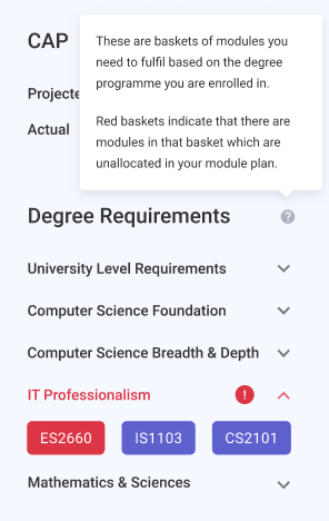
Degree/Graduation Requirements List - Indication for unallocated/allocated modules
The initial interface design under the Degree Requirements list (which shows important modules that are needed to be taken before graduation) was that the “red” dropdown arrows and “green” dropdown arrows should indicate to the user which levels of degree requirements that have not been completely fulfilled. They were meant to prompt users to expand the list to see which modules were not allocated.
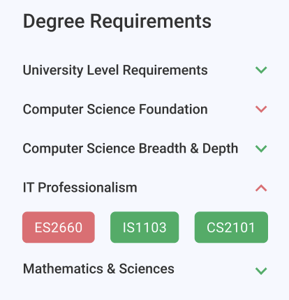
However, our users raised concerns that the red and green colours were not intuitive enough and seemed almost like a pattern (of alternating between red and green), which they did not associate as indicators of fulfilled or unfulfilled requirements. To minimise this error we decided to change this aspect of the prototype into red or default colour schemes in v2.
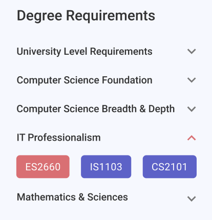
The second round of usability testing revealed that users still did not find this essential design aspect of the website obvious and and intuitive enough. Hence, to increase the visibility and comprehension of this design aspect, we decided to include badges as indicators of urgency as well as a short tooltip to explain the color coding.