Ideation and Prototyping Process
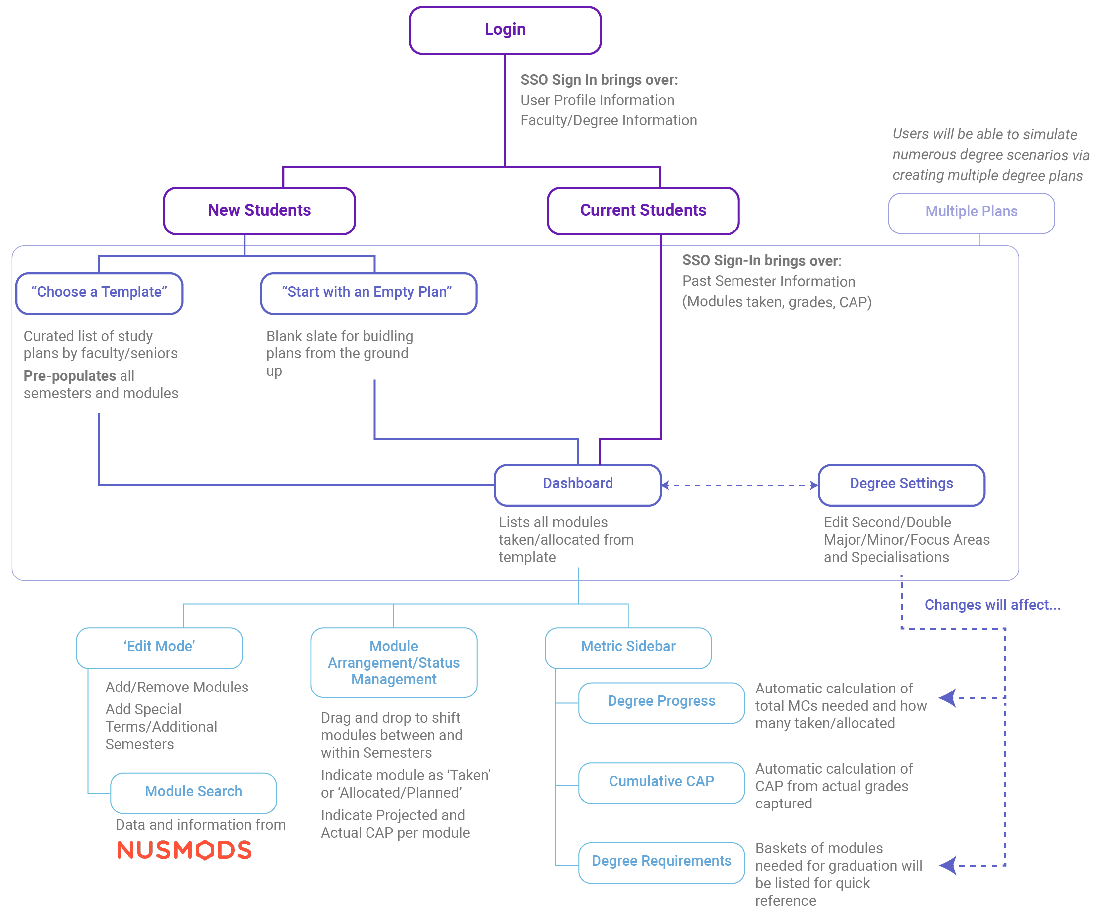
Using the personas and scenarios we curated from the user study process, we came together to discuss how to translate all the design requirements into a comprehensive user flow that would be the structure of our degree.ly website/platform. The following was a proposed user flow chart. It comprises key steps, screens, and features of degree.ly that would be essential to the degree planning process for our users.
Click on the user flow chart below to expand it.
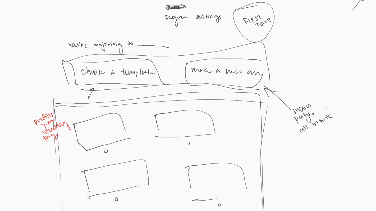
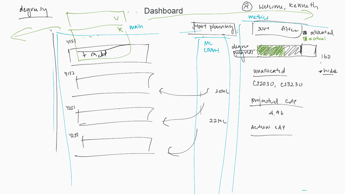
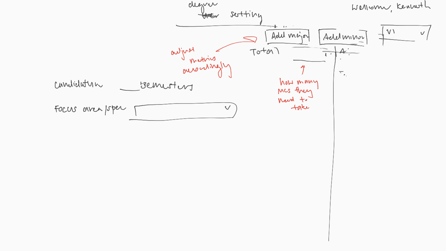
Using the user flow chart above, we then proceeded to sketch some low-fidelity prototypes/wireframes of the key screens and processes that the degree.ly platform would have. These were done on Google Jamboard.
Click on any of the Jamboard snippets below to start viewing the gallery.
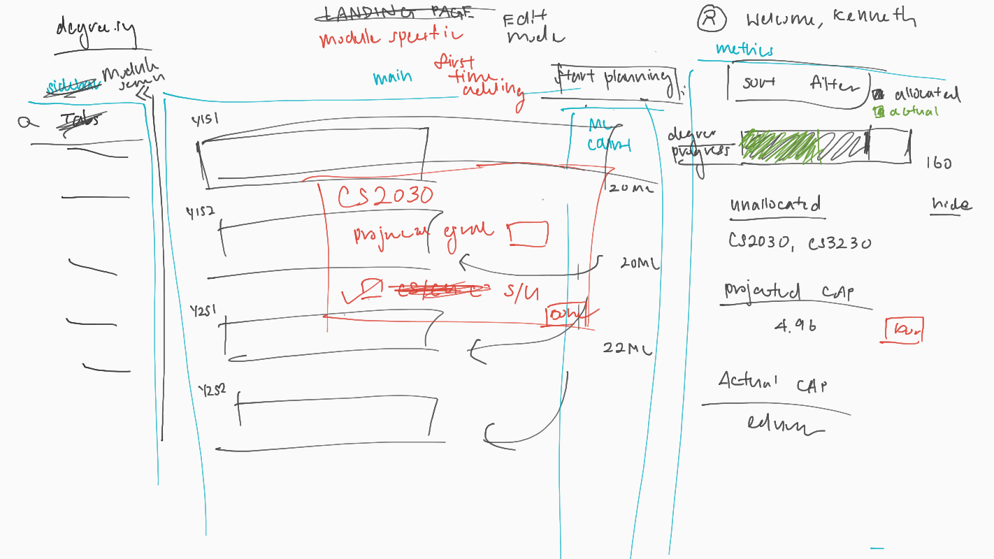
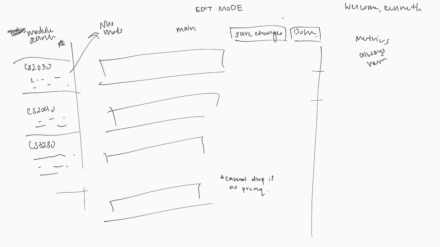
To better visualize and emulate the important navigation flows and user interaction points on each screen, we later moved from sketching low-fidelity wireframes to using a more mid-high fidelity prototyping platform, Figma, to continue our collaborative, rapid prototyping process.
First Iteration
You may view our interactive prototype here.
This version of the prototype was prepared for the pilot user evaluation test (peer evaluation) which was done with members of another project from our course. The evaluation observed how they navigated and interacted with the prototype, as well as the process by which they attempted to complete the tasks we prepared for them. This test also included an A/B test of two versions of the prototype in order to sample their preferred templates/module layout.
After compiling the users’ responses, we proceeded to make changes and came up with the second iteration of the prototype.
Second Iteration
You may view our interactive prototype here.
The second prototype featured changes we made to the interface based on the feedback gathered from the peer evaluation. We prepared it for evaluation by real/potential users (user evaluation), which was done with another set of 4 NUS students. After the mixed reactions and preferences reported in the peer evaluation, we decided to give users the option to choose between the A and B version of layouts for the website, making it an interactive feature on the platform. Hence this iteration did not include an A/B test as before.
The results from the second round of user evaluation were once more systematically considered before we proceeded to make changes based on them. This brought us to the Final Iteration of the degree.ly prototype.
Final Iteration
Having went through two rounds of iterative designs, we present the final iteration of degree.ly below:
You may view our interactive prototype here.
Throughout these iteration processes, bringing in users’ opinions and having them take part in the design conversation earlier before the final design has been extremely valuable and informative for our team. This is especially because they helped us identify problems we overlooked. Having gone through three iterations of our prototype, we hope that we have designed a user interface that better reflects the end-users’ needs and expectations towards our platform.
Our team also made great efforts to translate the prototype design into a more functional frontend implementation of our proposed interactive designs available here.